Packaging Is Your Silent Salesman: A 10-Point Packaging Design Checklist
Packaging is called a silent salesman because it does a salesperson's job without saying a word. On a shelf or a screen, it catches the eye, explains what the product is, makes the case for buying it and reassures the shopper that it is a safe choice. When nobody from your team is there to help, the box is doing all the selling.
That is a big job in a crowded room. The average US supermarket carried 31,704 items in 2023 (FMI), and online, your product sits in a grid of near-identical thumbnails. This guide explains what a good silent salesman does, then gives you a 10-point packaging design checklist to test your own box against.
Why is packaging called a silent salesman?
Think about what a good salesperson does in a store. They greet you, tell you what a product is, point out why it suits you, answer your questions and make you feel confident about the purchase. Good packaging does the same five jobs:
- It gets attention. It stands out from the products around it.
- It explains. It tells shoppers what the product is and who it is for.
- It persuades. It shows the main benefit and why it is worth the price.
- It reassures. It answers practical questions and signals quality.
- It reminds. It helps customers find you again when they come back to buy more.
The difference is that packaging works on every shelf, in every store and on every doorstep at the same time, and it never takes a day off. For the research on how much this affects buying decisions, see our guide on whether packaging affects sales.
The 10-point packaging design checklist
Use these ten questions to review a new design or audit the box you already have. Each one comes with a quick test you can do yourself.
1. Can shoppers spot it from three steps away?
Shoppers do not read a shelf. They scan it. Researchers who tracked shoppers' eyes in a grocery store found that physical design features such as shape and contrast dominate the first phase of searching (Journal of Retailing and Consumer Services). Words come later.
The test: place your box among competitors, step back about three steps and squint. If it blends into the row, it needs stronger contrast, a bolder color or a more distinctive shape.
2. Is the product clear in three seconds?
A shopper should know what the product is and who it is for almost instantly. Clever names and abstract designs are fine, as long as something on the front panel says plainly what is inside.
The test: show the front of the box to someone who has never seen it for three seconds, then ask what the product is. If they cannot tell you, the design is working against you.
3. Does the front panel have one focal point?
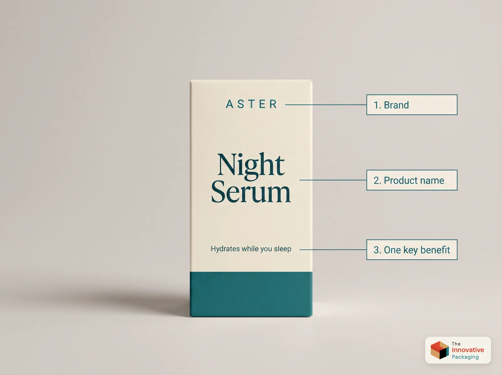
The best packaging guides the eye in a clear order: brand, then product name, then one key benefit, then everything else. When five elements compete for attention, none of them wins.
The test: ask what you notice first, second and third. If the answer is not the order you intended, make the most important element bigger and the rest quieter.
4. Do you own a color?
Color is the fastest way for a returning customer to find you. Pick one main color and use it consistently, so shoppers learn to spot your products without reading a word.
The test: cover your logo. Would a regular customer still recognize your product on the shelf?
5. Is the type easy to read?
Thin script fonts, low contrast and tiny type all make a box harder to sell. Keep to one or two typefaces, make sure text stands out clearly from its background and give the product name enough size to read at a glance.
The test: print the design at actual size and read every line at arm's length. If you have to squint, so will your customer.
6. Does the back panel close the sale?
The front panel earns the pickup. The back panel often decides the purchase. This is where shoppers look for directions, ingredients, sizes, warnings and anything that answers their doubts.
The test: list the three questions customers ask most often, then check that the back panel answers each one clearly.
7. Does it work as a thumbnail?
Many customers will see your packaging first in a product photo, often no bigger than a postage stamp. Fine details disappear at that size, while bold shapes and strong color survive.
The test: shrink a photo of your box to the size of a phone thumbnail. Can you still tell what it is and who made it?
8. Does the material match the price?
A premium product in thin, flimsy board loses credibility the moment it is picked up. Board weight, lamination and finishes should match what you charge. Our guide on how to make packaging look expensive shows which upgrades do the most for the money.
The test: hold your box next to a competitor at the same price. Does yours feel at least as solid?
9. Will it survive the shelf and the trip?
A retail box gets picked up, put back and knocked around many times before it sells. Gloss shows fingerprints and smudges more easily, while matte hides them better, as our guide to matte vs gloss lamination explains. A dented corner or a crushed lid tells shoppers the product inside may be damaged, too.
The test: handle a sample box twenty times, the way shoppers would. Does it still look new?
10. Does it match the rest of your range?
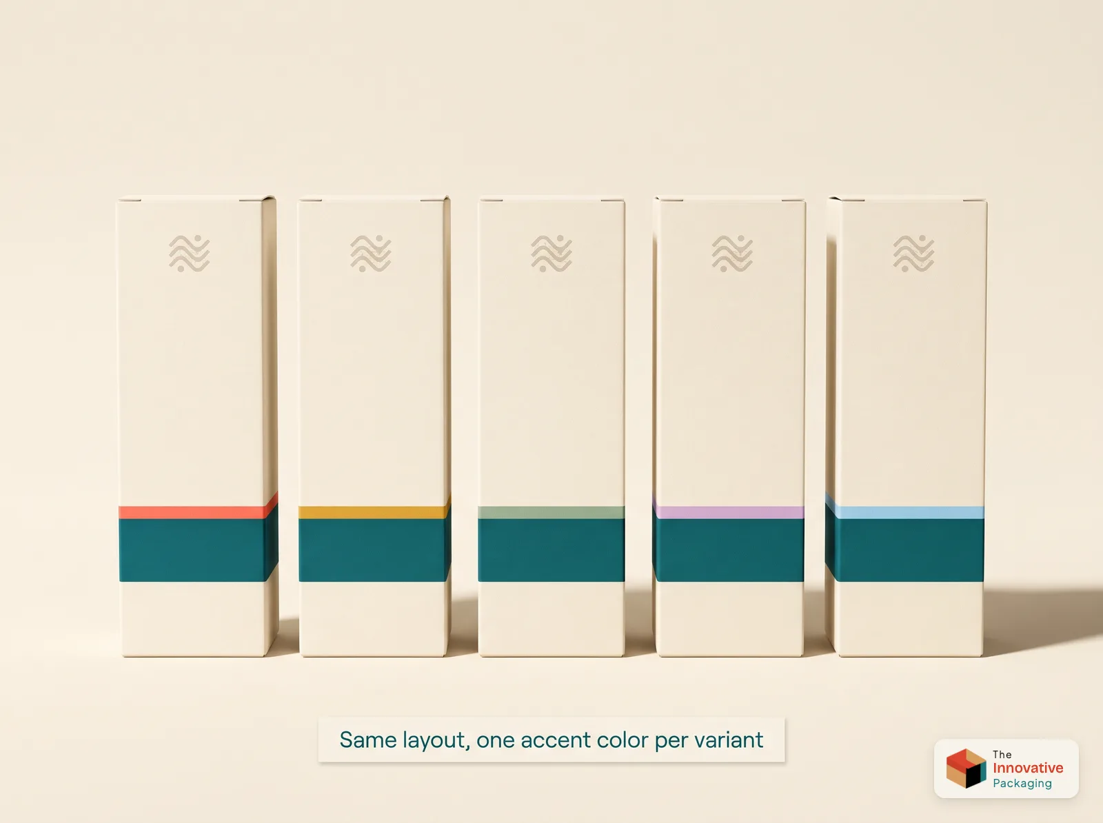
A single good box helps one product. A consistent range helps every product. Keep the same layout, type and main color across your line, and change only one accent color for each variant or flavor.
The test: line up every product you sell. Do they look like one family?
Small details that keep selling
A silent salesman does not stop working at the register. A few small touches keep selling long after the purchase:
- A window that lets shoppers see the product, as on a tuck end box with a window.
- A printed interior that surprises customers when they open the box.
- A fitted insert that presents the product neatly and protects it.
- A counter display that keeps a small product upright and visible next to the register, like our display boxes.
- A thank-you card that adds a personal touch and invites a second order.
For online orders, the shipping box takes over the salesman's job. Our guide to ecommerce packaging covers that side.
Common packaging design mistakes
- Putting every product benefit on the front panel.
- Choosing a font for personality over readability.
- Changing colors and layouts from one product to the next.
- Designing on a screen and never checking the box at actual size.
- Forgetting where the folds and glue flaps fall, so text ends up on an edge.
The last one is easy to avoid. Every custom box starts as a flat template called a dieline, and placing your artwork on it carefully keeps every panel clean. Check the digital proof closely before you approve it, and our materials and printing guide will help you choose the right board and finish.
Let your packaging do the talking
Your packaging speaks to more customers than your team ever will. Give it a clear message, a strong look and the details that build trust, and it will keep selling on every shelf and every doorstep, long after the conversation ends.
Want a box that sells for you? Send us your product, its size and where it will be sold, and we will recommend a structure, board and finish to match. Orders start at 100 units, every order includes a free dieline and a digital proof before printing, and shipping is free anywhere in the USA. Request a free quote for custom retail boxes.
Founder & CEO, The Innovative Packaging · 10 years experience
Ijlal Ahmed founded The Innovative Packaging and runs its production facility in Pakistan. He is the third generation of his family in printing and packaging, a business they have been in for more than 50 years, and works directly with brands on quotes and dielines. He holds a BSc in Economics from the Lahore School of Economics.
Ijlal Ahmed on LinkedInFrequently Asked Questions
Shop the packaging in this guide
Custom Retail Boxes
Looking for high-quality custom retail packaging boxes wholesale that help your products stand out on shelves? At The Innovative Packaging, we produce fully custom retail boxes tailored to your brand identity, product dimensions, and retail environment. Whether you need packaging for cosmetics, food, paper bags, mailer boxes, or display packaging, we have a solution for every retail product in your lineup.
Browse Custom Retail Boxes →Custom Display Boxes
Looking for high-quality custom display boxes wholesale that maximize your product visibility at retail? At The Innovative Packaging, we produce fully custom display packaging tailored to your product dimensions, brand identity, and retail environment. Whether you need counter display boxes, floor display units, or shelf-ready display packaging, we have a solution for every product and retail setting.
Browse Custom Display Boxes →Custom Cosmetic Boxes
Looking for premium custom cosmetic boxes wholesale that make your beauty brand stand out? At The Innovative Packaging, we produce fully custom cosmetic packaging tailored to your exact product dimensions, branding, and retail requirements. Whether you need boxes for perfume, serum, lip gloss, hair products, essential oils, or face care kits, we have a packaging solution for every product in your beauty lineup.
Browse Custom Cosmetic Boxes →More from the blog
Does Packaging Affect Sales? How Design Changes What Customers Buy
Packaging affects sales more than most brands expect. Here is how packaging design shapes what people buy, from shelf appeal and color to perceived value, trust and the unboxing, with the research behind each point.
Read more →8 Ways to Make Your Packaging Look Expensive on Any Budget
The most expensive-looking packaging is rarely the most expensive to make. Here is how to make packaging look premium on a small budget: a calmer design, heavier board, soft-touch lamination, one well-chosen finish and an unboxing worth remembering.
Read more →What Is a Dieline? A Complete Guide to Packaging Dielines and How to Make One
What is a dieline? It is the flat plan that shows where a box is cut, folded, glued, and printed. Learn the parts, the line types, and how to make one in 7 steps.
Read more →